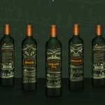
Many manufacturers put a lot of work into creating unique wine and beer labels so they’ll be more interesting than other brands. This is a great way to set apart the bottle to catch the eye of shoppers in the store, but it’s also the best way to inject a little personality into the product. 
Bottle labels appeal to more people than just potential customers looking for a great drink for their party. Bottle collectors around the world add to their stock piles based on the uniqueness of the bottles rather than the year and type of the wine inside.
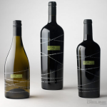
One important aspect of a creative label is its ability to infuse culture and beauty into the design like the one seen below in the Vine Parma Wine. The design is beautiful and classy, but in the lines lies more than meaningless swirls. Upon closer inspection, you will notice that there are basic details about the wine like the bar code, alcohol content, distribution information and more spun among the art work, making this a true masterpiece.
 One of the best ways to make a bottle label more memorable is by inserting a little humor while still maintaining a classy feel. Laughing Stock Wine takes this approach with their labels, using their stock symbol their name on each bottle. The year is placed below the symbol where it’s easy to see, and the different bottle shapes make them a fun addition to a collection.
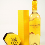
Whatever your preference is on sweet wine, you have to appreciate this packaging. The detail on the Honey Moon Wine bottle is attractive, bright, and very creative. There are a lot of bottles that harness this kind of creativity, but the small details like the cork takes this one step beyond the rest.
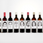
 This next set of bottles is a collector’s dream because it is practically a collection within a collection. The Gut Oggau Portrait collection comes from Austria and the labels were designed by the artist Jung von Matt. Each bottle was given his unique signature in the design. The reason there are many faces is because he believed that just as every man has his own preference with drink, every one should be represented. This has led to a generic family grouping with many generations, grandparents, parents, and children.
 The last label is one that has a fun tradition behind it. The Spooks Ale brand has been the official Ghost Brew for All Hallows for years so the labels are intended to look creepy. While this could easily be a tacky, over-the-top design, this bottle label worked perfectly because the blood spatters and stains that seep in on the edges are merely scary accents that create an atmosphere that fits the theme.
The next time you are picking out the perfect beer or wine for your party, stop for a minute and notice the labels. There is a lot of creativity that goes into some of them. Who knows, if you take some time to start appreciating the character and personality in these labels, you may even end up starting your own unique label collection.

